
Branding
Client Lenovo
Challenge
Bring Lenovo’s new brands (Vibe and P2) to life and seem premium at retail for the new product launches. Both products didn’t have groundbreaking features as their competitors have it already. The products are a “great value for your money” type but client felt it will devalue the products.
Insight
Target audience likes to look good and live their lives to the fullest while always looking for ways to enhance it.
Idea
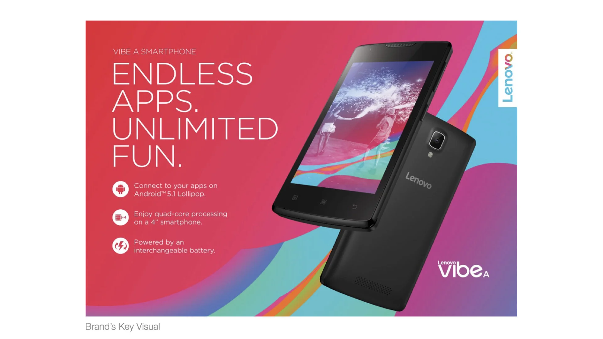
Connect with Your Vibrant World the Smarter Way
Solution
How do you stand out in a highly competitive industry when only given a Key Visual and newly developed Brand Guidelines for 2 new products that have no groundbreaking features? Lead with what the target audience cares most in a simple, stunning design with strong stopping power.
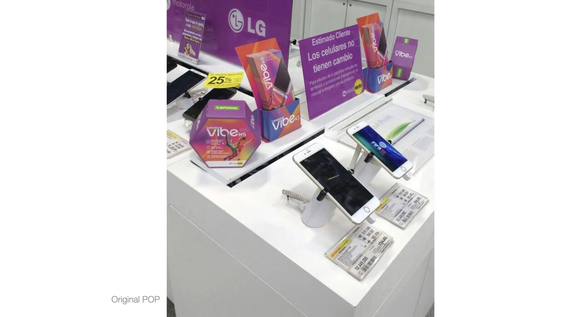
My team and I were assigned to develop global toolkits and bring the new brands to life at retail while collaborating with another team tasked to create banners and videos. We’ve explored ways to be uniquely visual at retail while being within brand for visual stopping power and to inspire purchase.
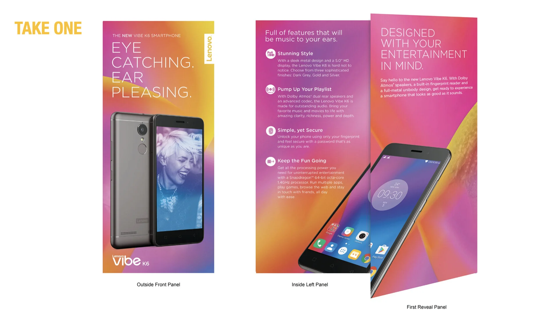
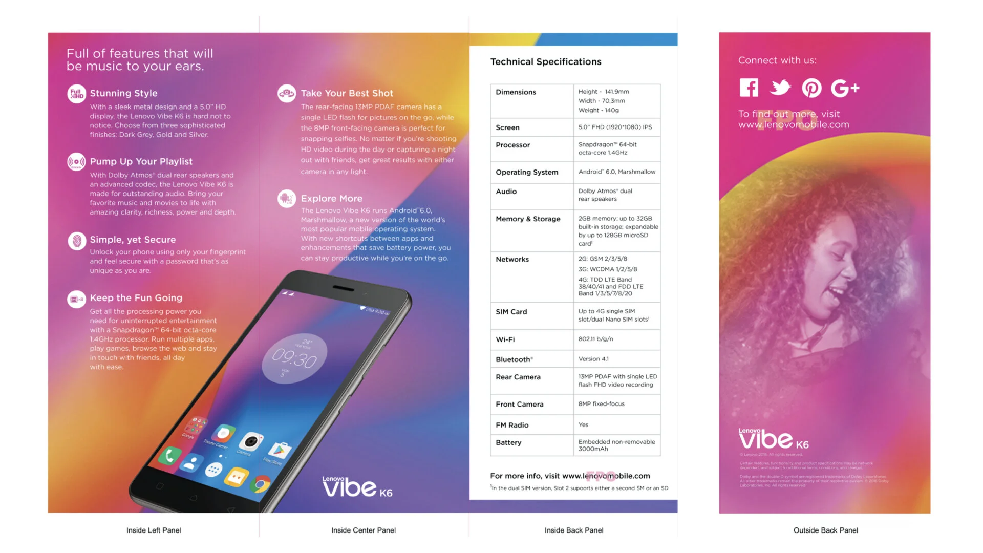
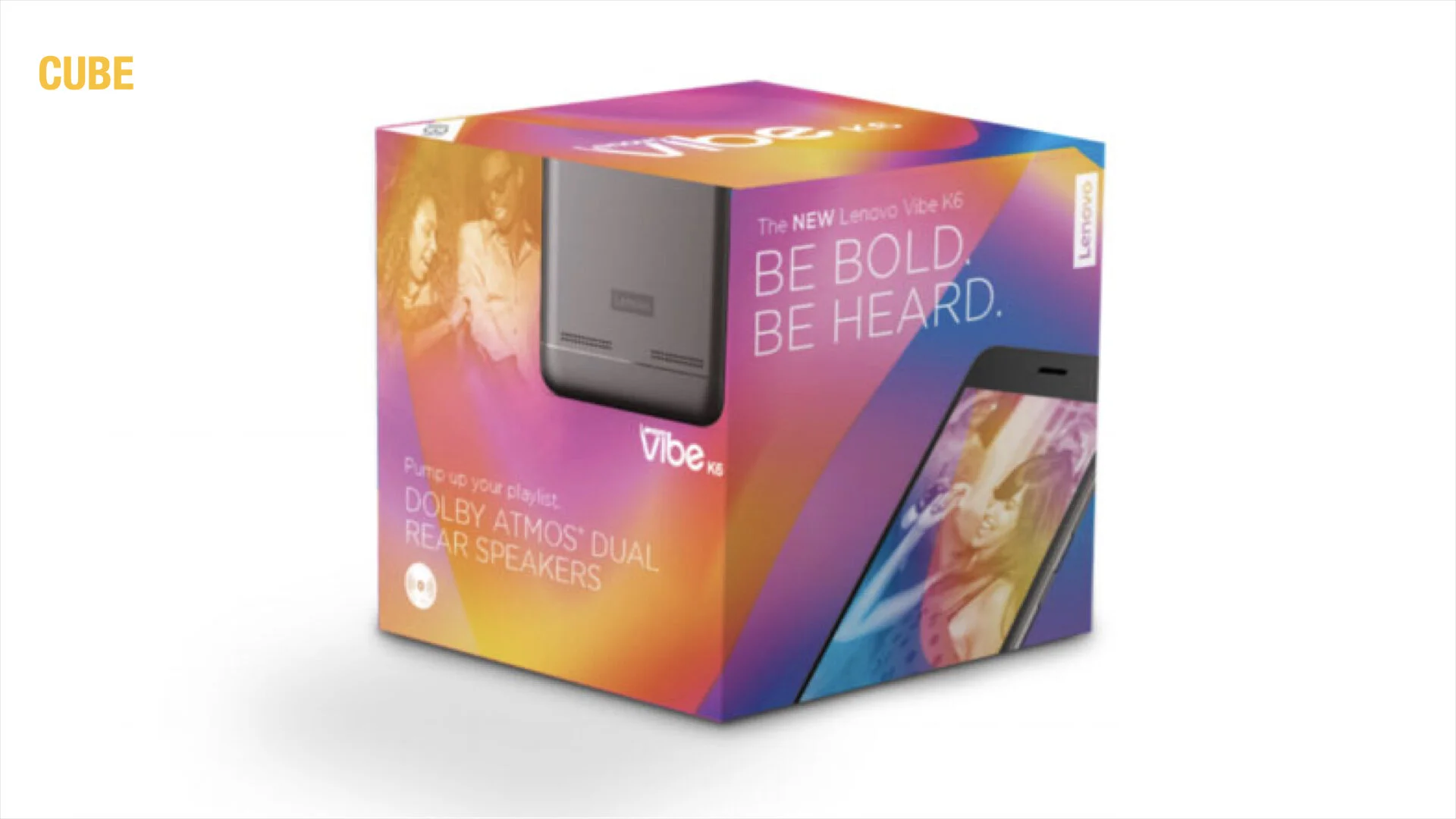
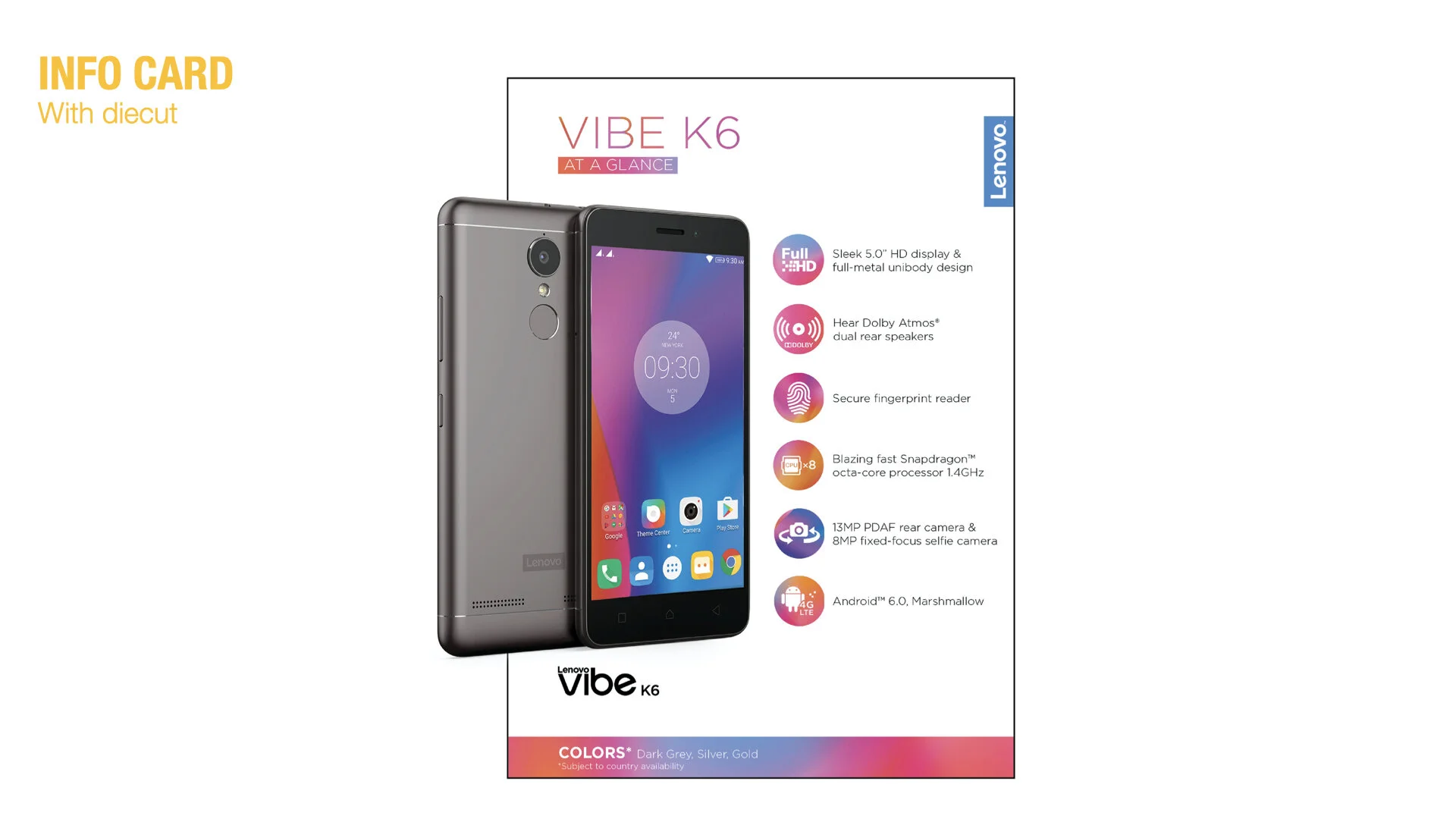
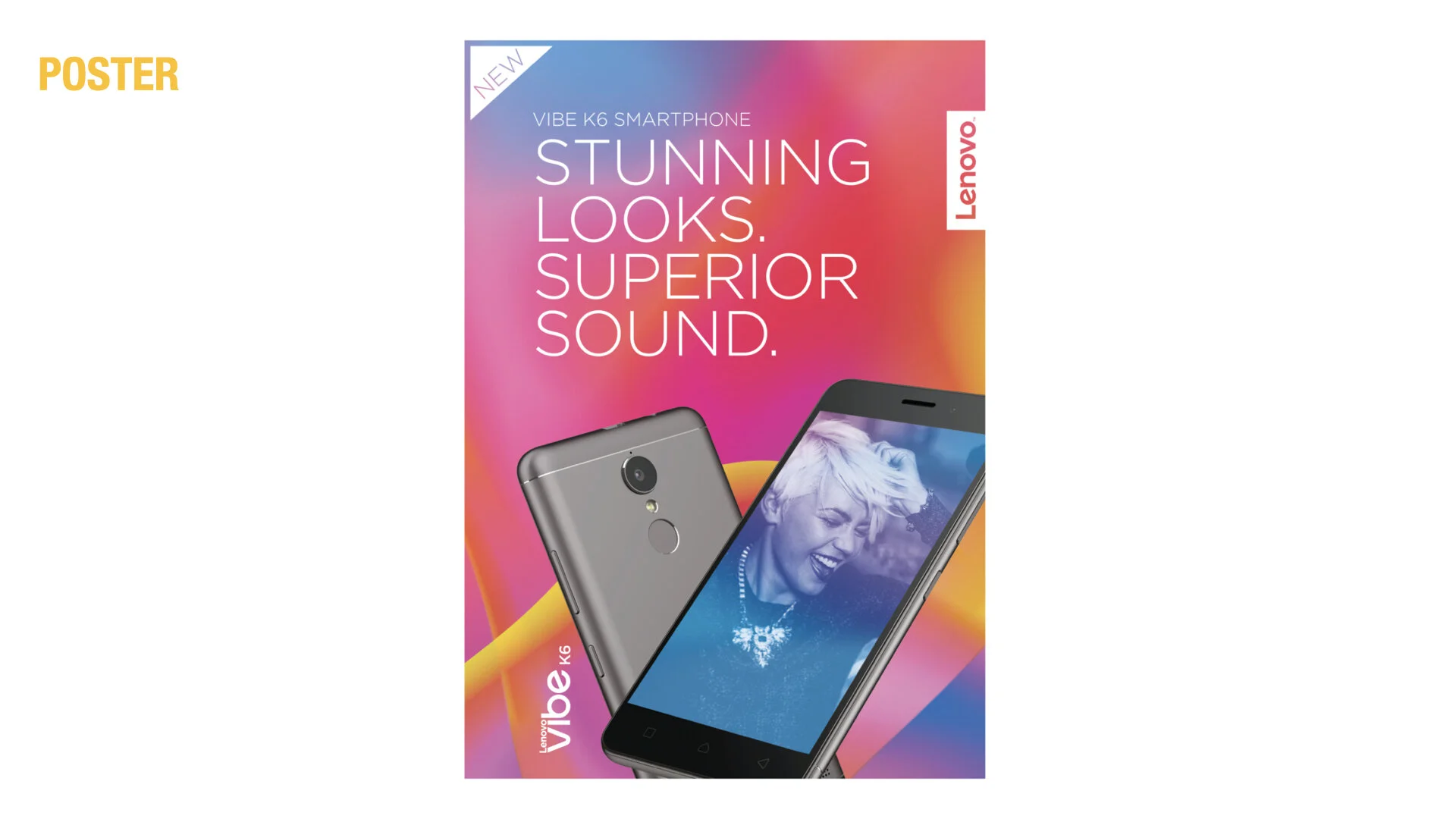
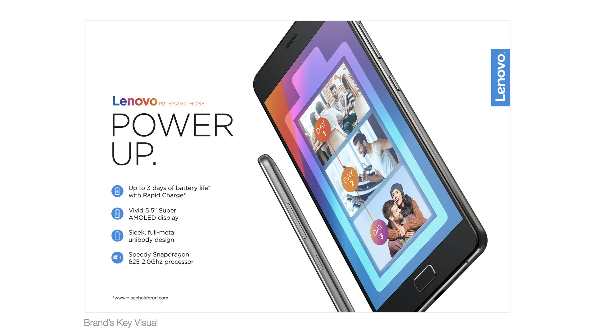
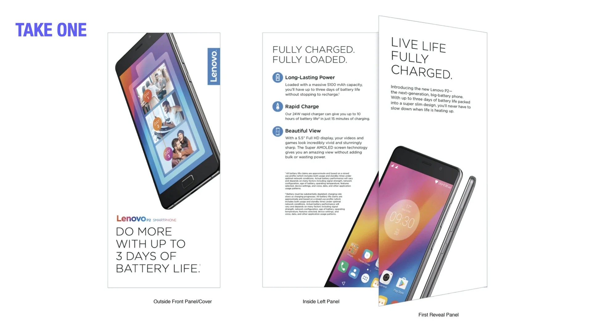
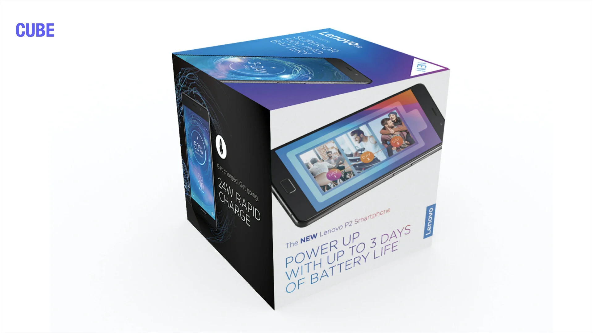
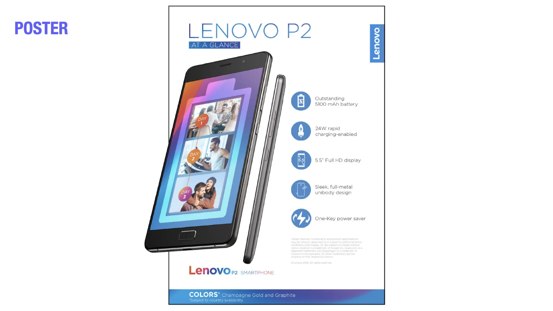
Targeted towards students and mid- to low-income working adults (ages 18-36), the Vibe and P2 were all about how the phone fits into their life. Not the other way around. So I’ve worked and pitched in with my team to develop a way to incorporate fun with the brand’s vibrant ombre color scheme for the Vibe (skewed younger) while for P2 (skewed older) was predominantly white using the ombre colors as support, prominently featuring its key benefit. What could turn out very busy, we’ve developed simple messaging with a simple design of typography and icons to help create a premium feel while keeping the design fun for the product and enticing for the Shopper.
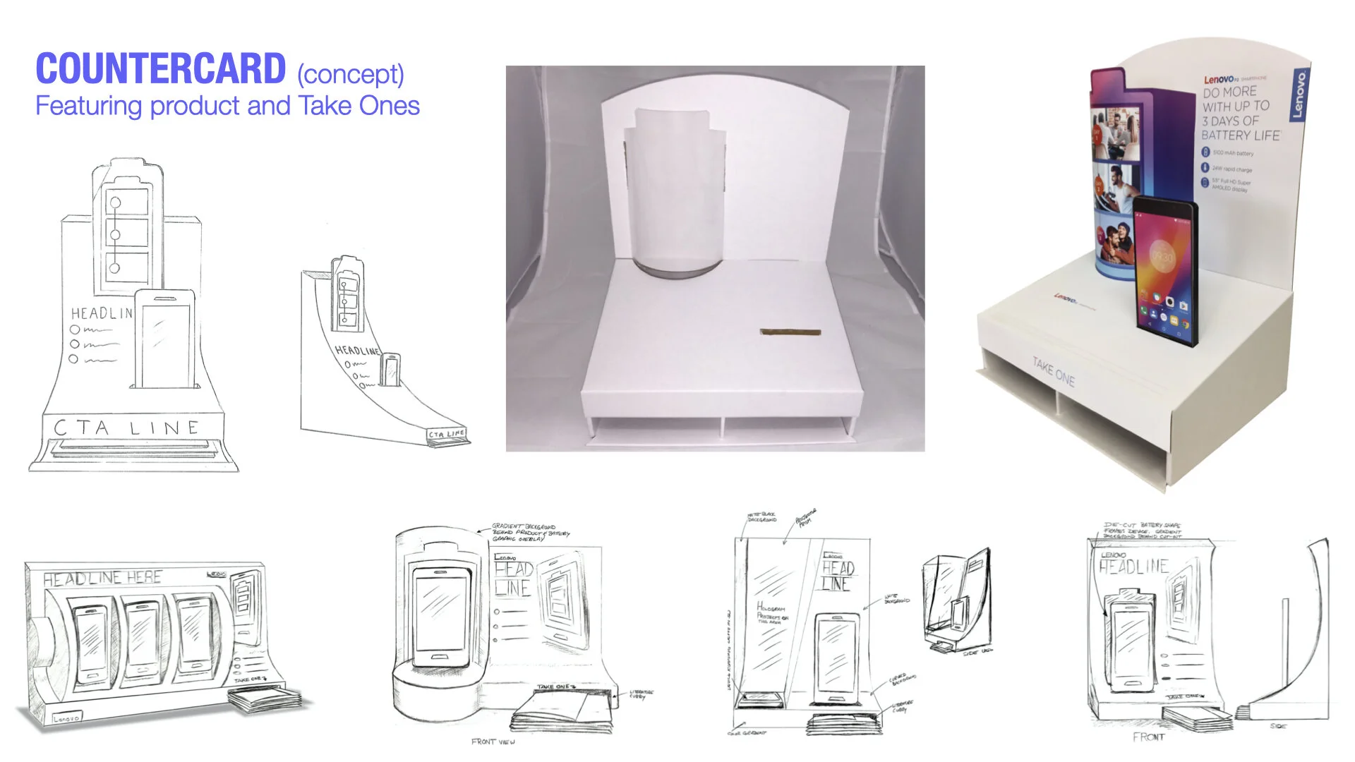
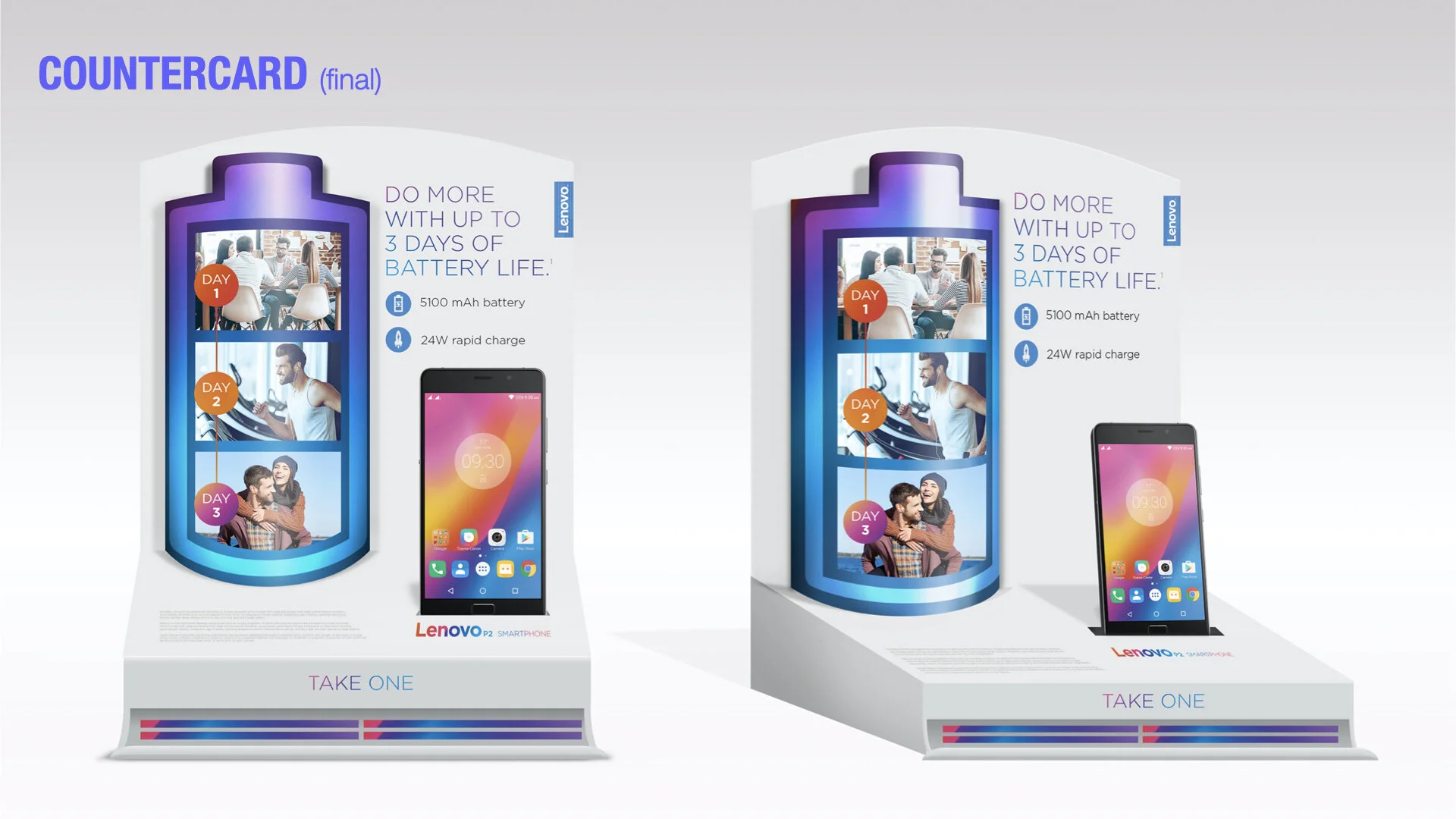
We also tried to make each element unique in how it commonly functions or seen as to further support the fun approach. Like, for instance, the P2 Countercard I’ve designed. Rather than a traditional Countercard with a pocket of Take Ones, collaborated with the production team to find a way to produce a unique construction that’s efficient with space since the toolkit had to work with any retail space. The battery-shaped hero visual was printed on an acetate to bend the visual and give dimension as a way to attract the eye. While simple slots helped to hold the product itself and Take Ones at the bottom letting the weight of these help to anchor the Countercard.
In the end, 2 distinct looks were created for the Vibe and P2 brands for 2 audiences with global toolkits containing elements that demand attention and created intrigue for the new products.