
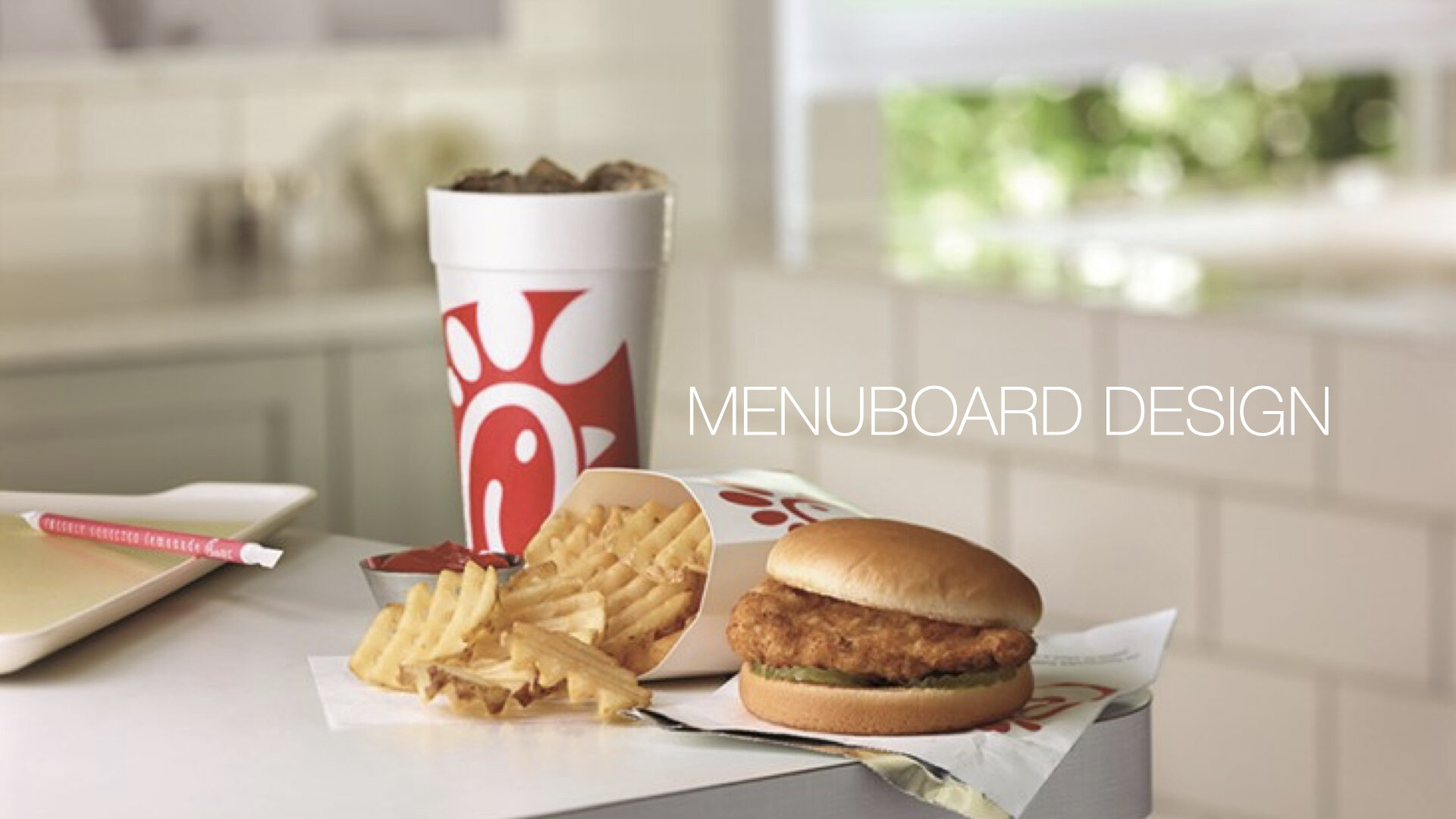

MENUBOARD DESIGN EXPLORATION
Client Chick fil A
Challenge
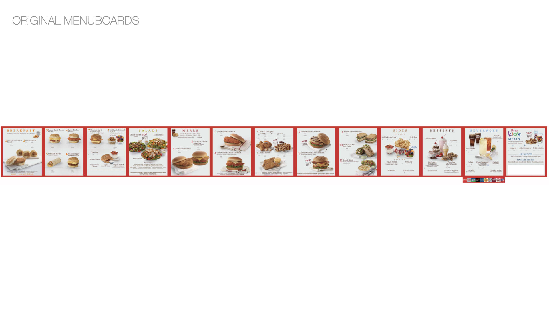
Develop concepts for optimized indoor and drive-thru menuboards to be tested in The Hatch (Chick-fil-A’s test site) and to be rolled out nationally.
Insight
There’s little opportunity to menu explore—but shouldn’t be in the way of ordering efficiency.
Idea
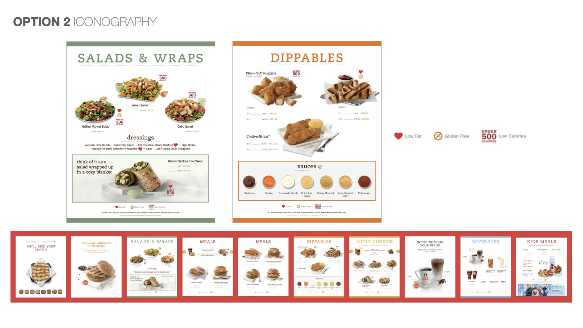
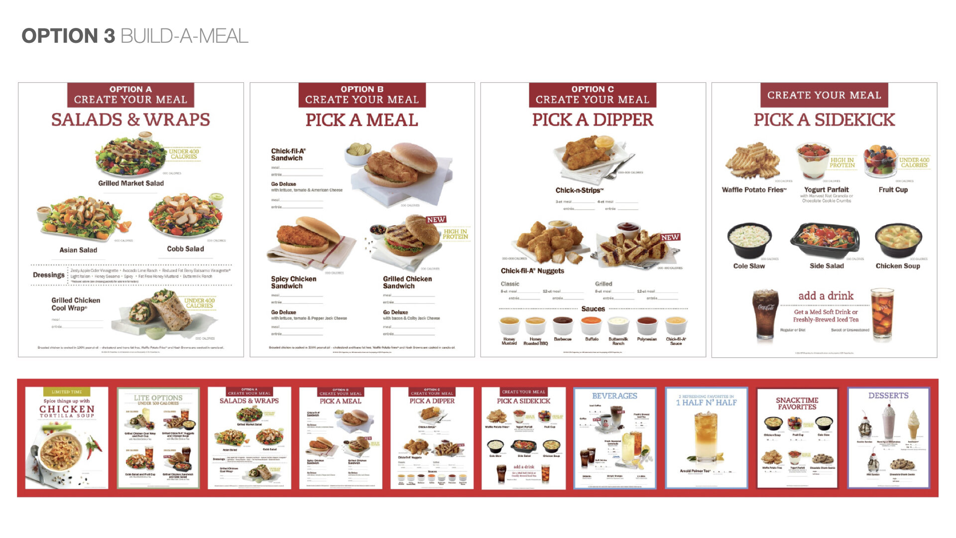
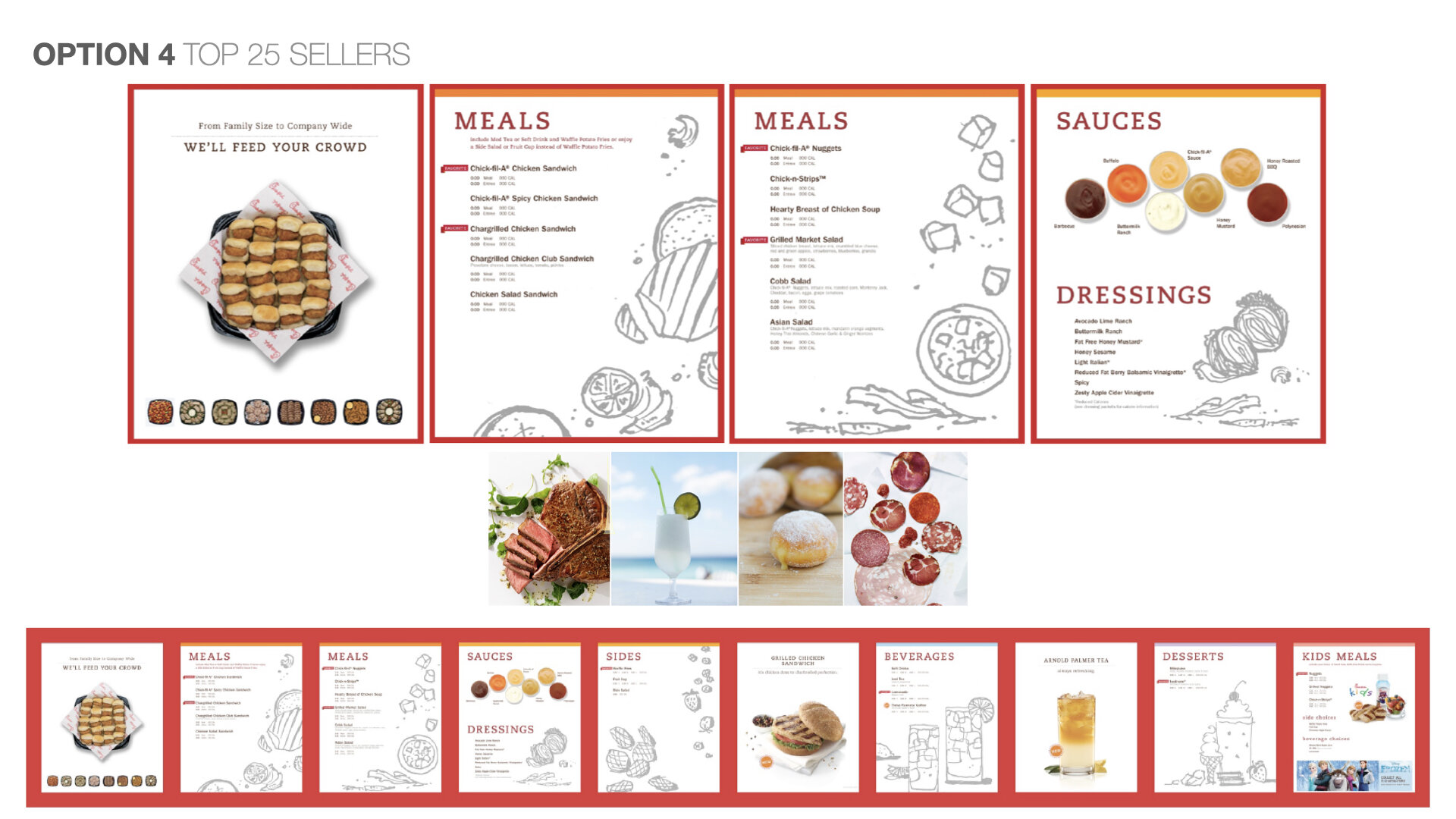
Top 25 - Feature best sellers in each category and introduce new products in rotation.
Solution
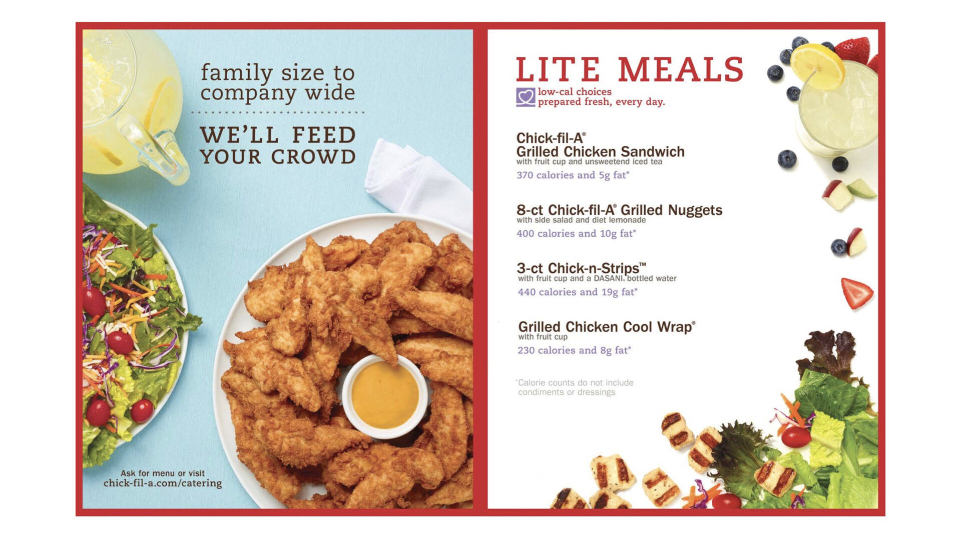
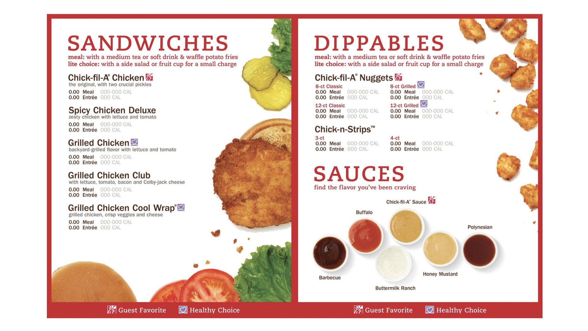
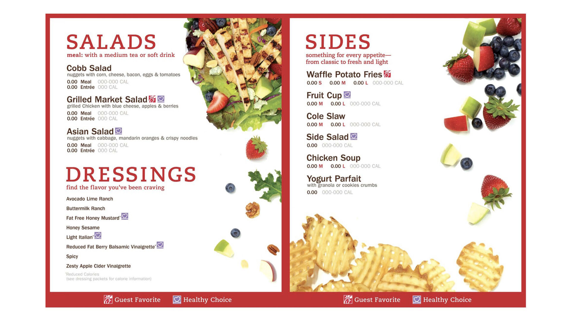
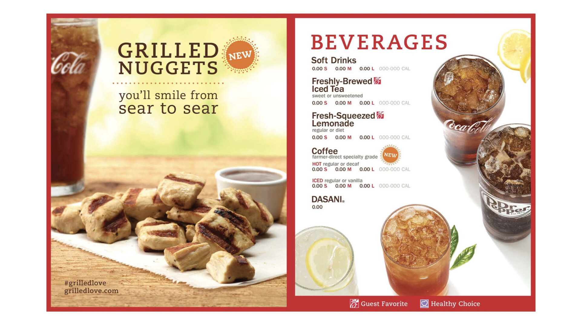
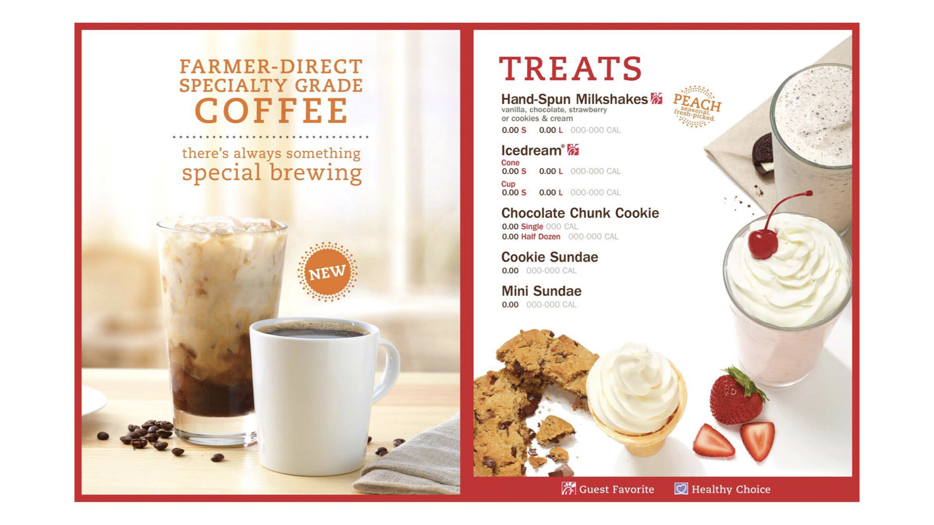
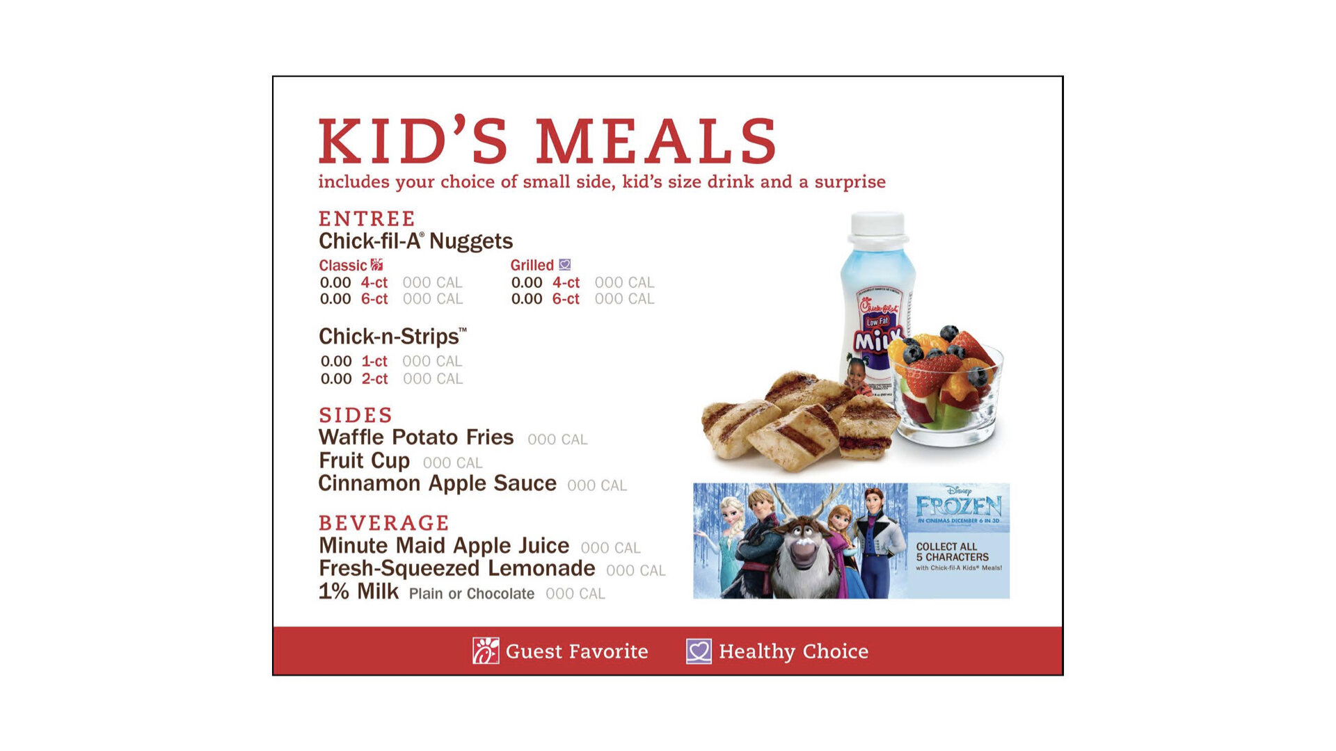
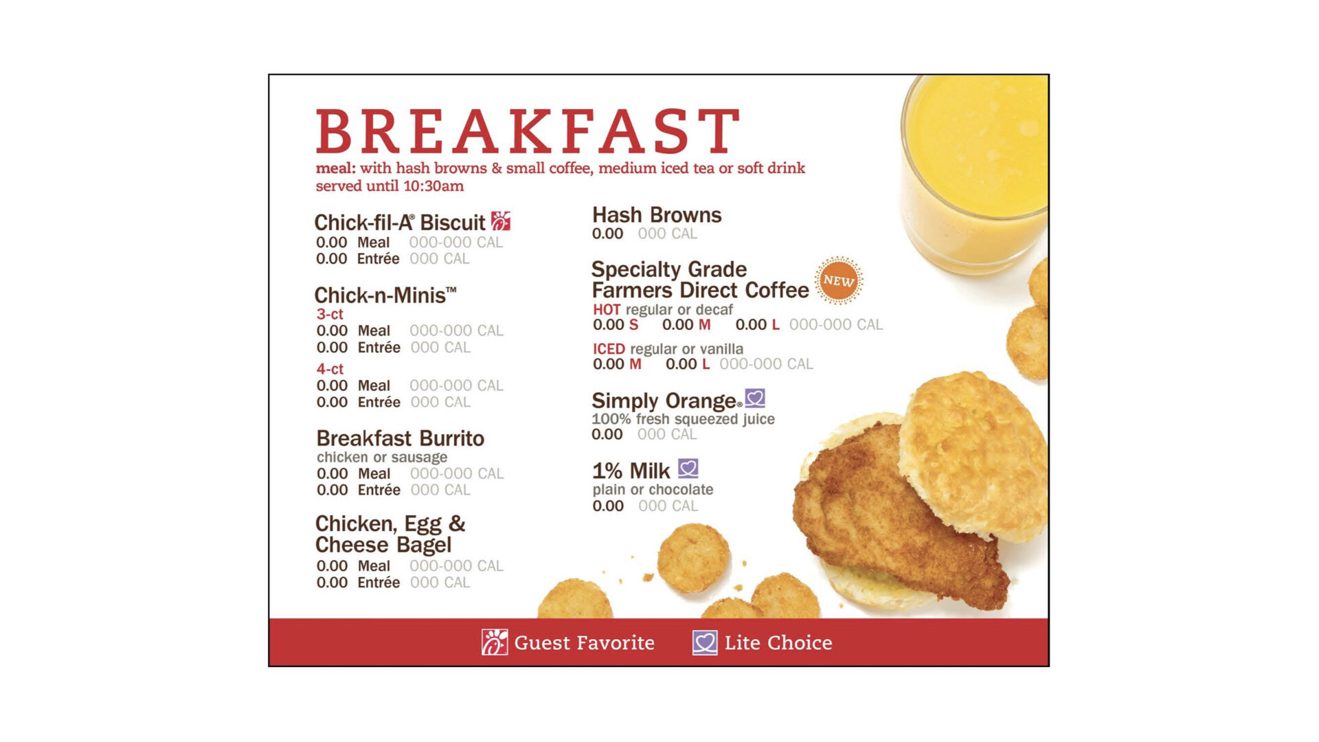
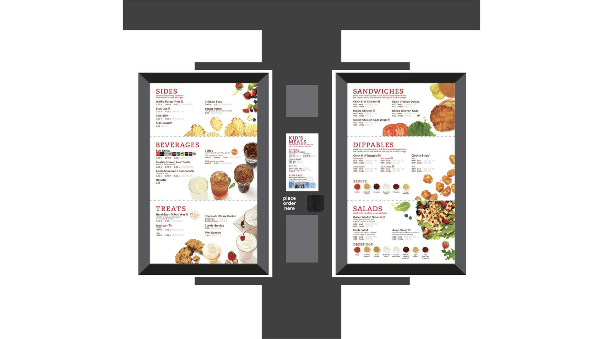
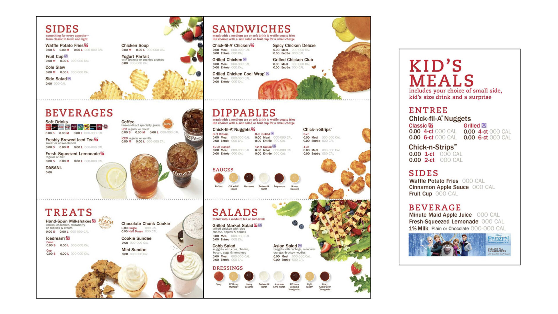
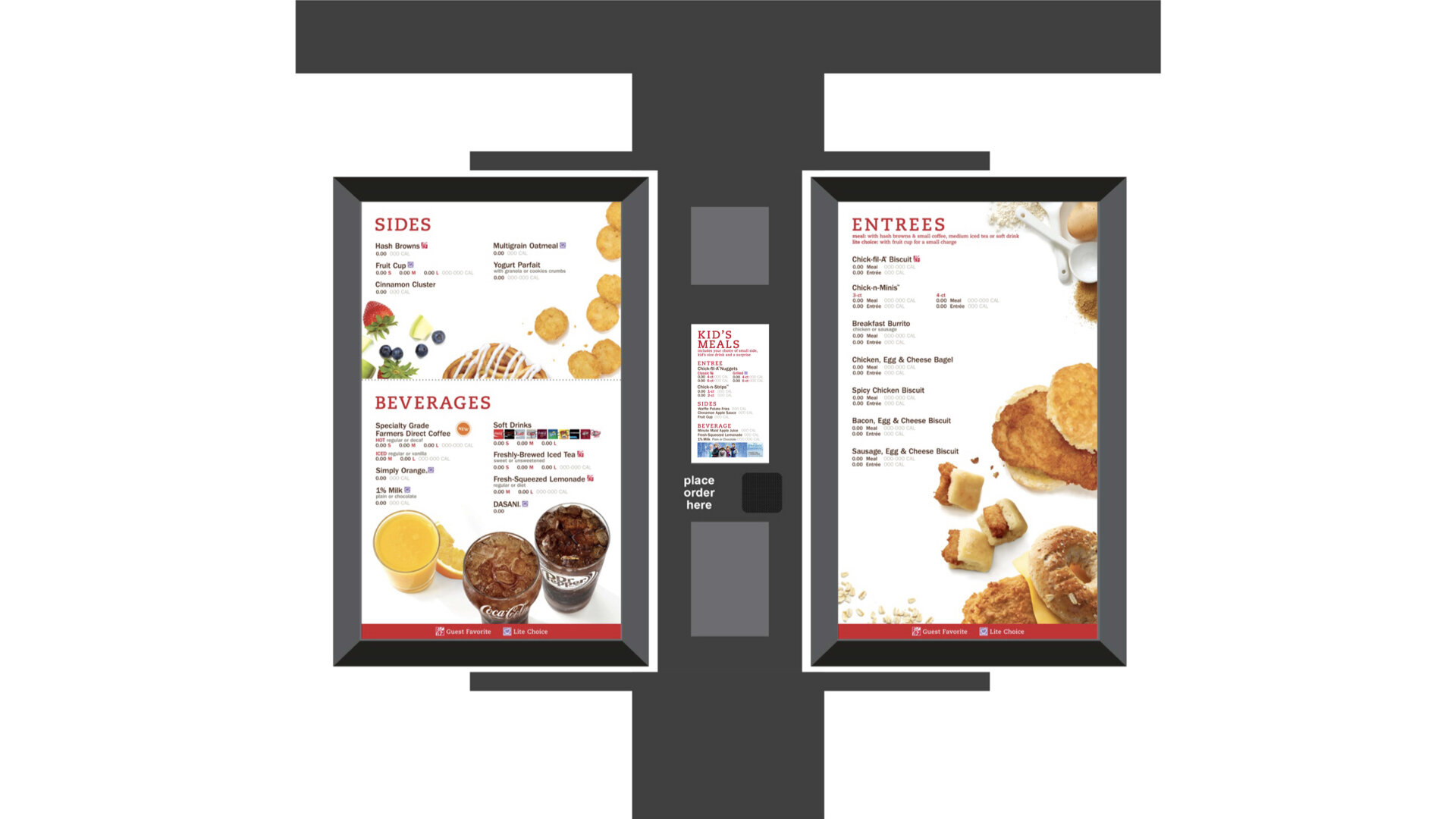
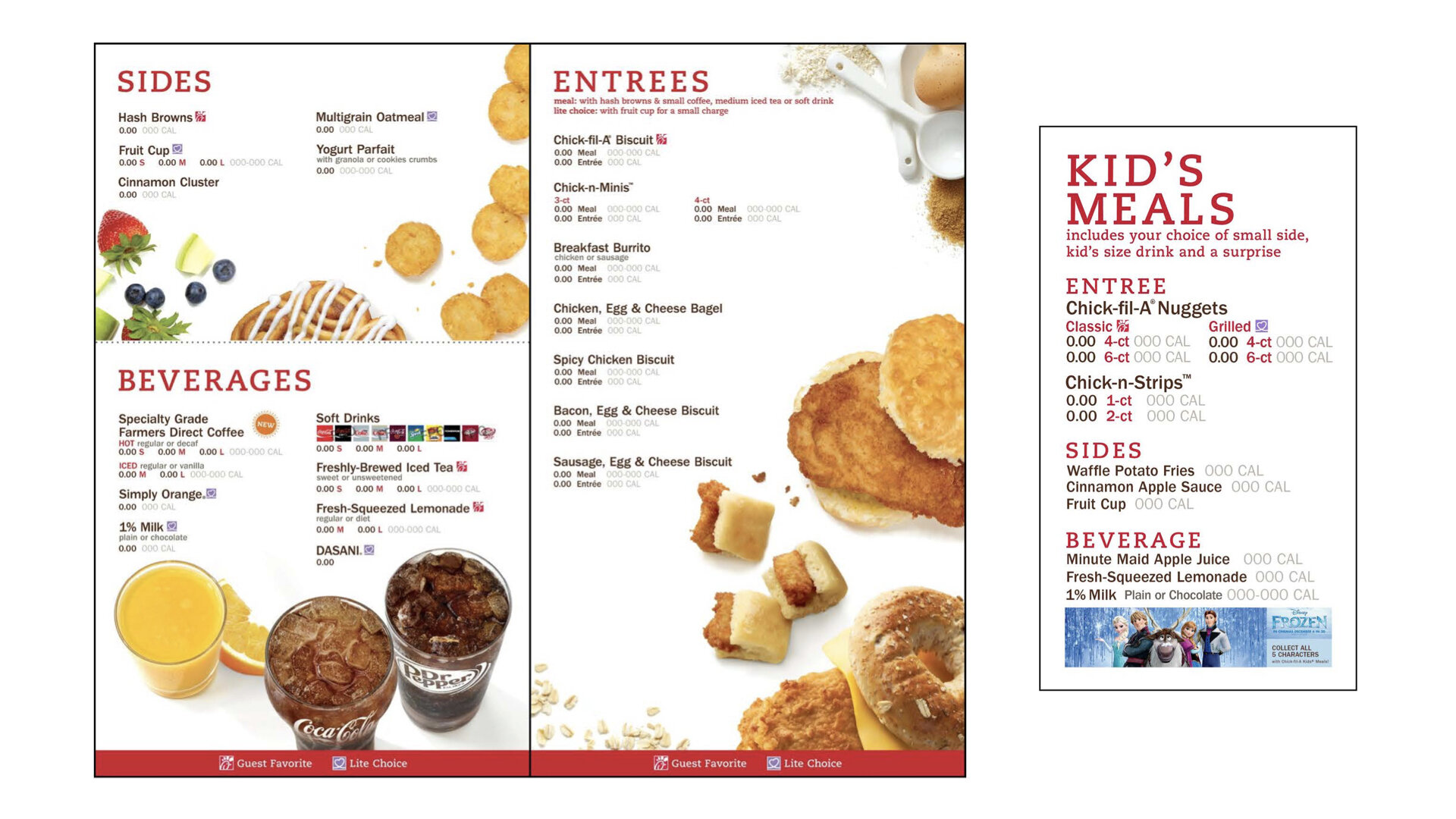
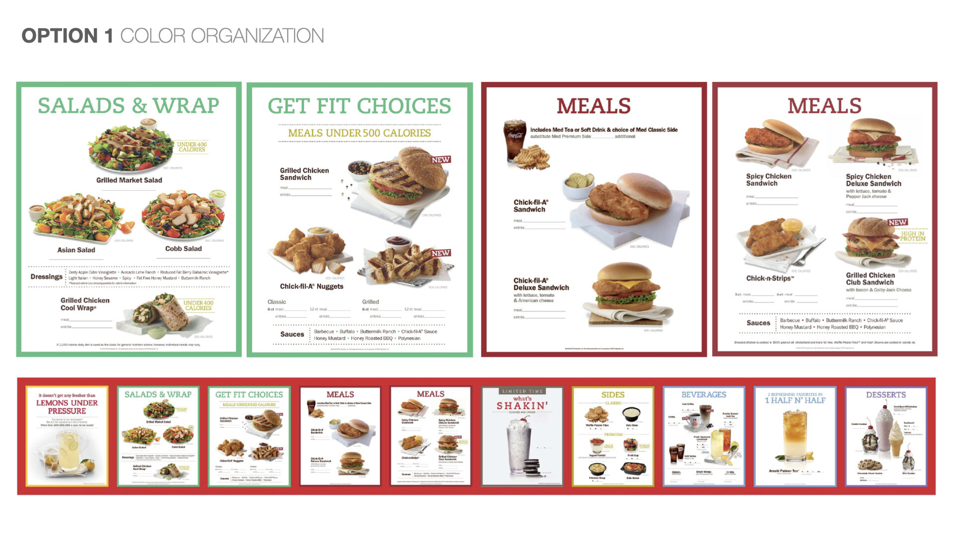
Explored a range of approaches with a team I’ve led and helped as well. From organizing categories by color to creating a system of icons for quick reference to finding ways to guide the customer in decision making but still be able to menu explore. This was months of work in the making involving lots of research and exploration.
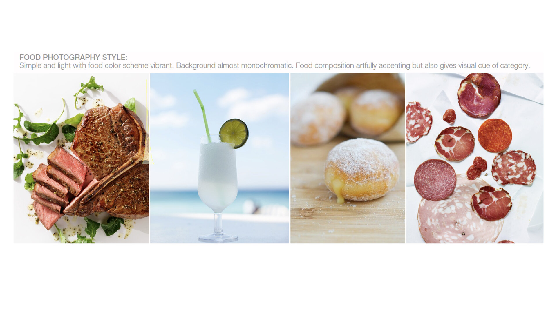
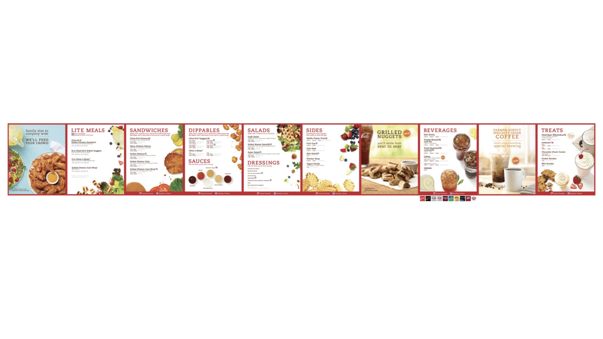
The approach the client selected was the Top 25 Seller concept where only top performers in each category that make up 95% of sales is featured. This helped to simplify the amount of products shown and provided breathing space without influencing revenue negatively. Interspersed are “spotlights” that promote new products to help give visual breaks in a row of 10-13 backlit menuboard panels in a pre-existing CFA red frame. With the perspective of a chef’s point of view, gave photography a unique style. Displayed “deconstructed products” where the vibrant food composition shows off CFA’s simple ingredients that artfully accents but also provides a visual cue to the category. Actual CFA food was shot with no special enhancements in CFA’s test kitchens. Showing less products and featuring a product not in its full complete form was a big and bold step CFA have never taken before. Once finalized, was brought to The Hatch in CFA’s Atlanta headquarters where there is an actual mock up of the restaurant for both indoor and drive thru to test the new menuboards with actual customers participating in focus groups.